Tuesday, November 30, 2010

Type Americana: Part 4 (Font Workshop)

This is the fourth and final post in the Type Americana four-part blog post series. The last workshop was Think/Write with Sumner Stone. Mr. Stone spoke the day before about his time at Adobe. Above is a slide shown during his lecture of him, sketching. During our time with the renown type designer, we sketched out several strokes, scanned them and imported them into Type Tool (font software) and created our own custom fonts, with hand-written qualities. It was so fun! Even with a measly two hours in the lab, many of us were able to complete a majority of the alphabet. I even squeezed in some punctuation characters, like the comma, question mark and period.
My font friends, Laura and Glenn. Remember Glenn from Part 3?
A sample of my very first font, 'Clark'. Creative name, right?
We wrapped up the afternoon with a short critique with Sumner, part of which I captured on video and have shared here. The video also includes some of the introduction session. Enjoy! (I certainly did.)

Thanks again SVC. You're the best.

Wednesday, November 24, 2010

Type Americana: Part 3 (Letterpress Workshop)

Here resumes the Type Americana 4-part blog post series, with our Letterpress Workshop. After a Friday full of lecture and and evening film screening, we flitted back to SVC on Saturday for some hands-on type fun. That's exactly what we got. Messy, colorful, active type via letterpress.

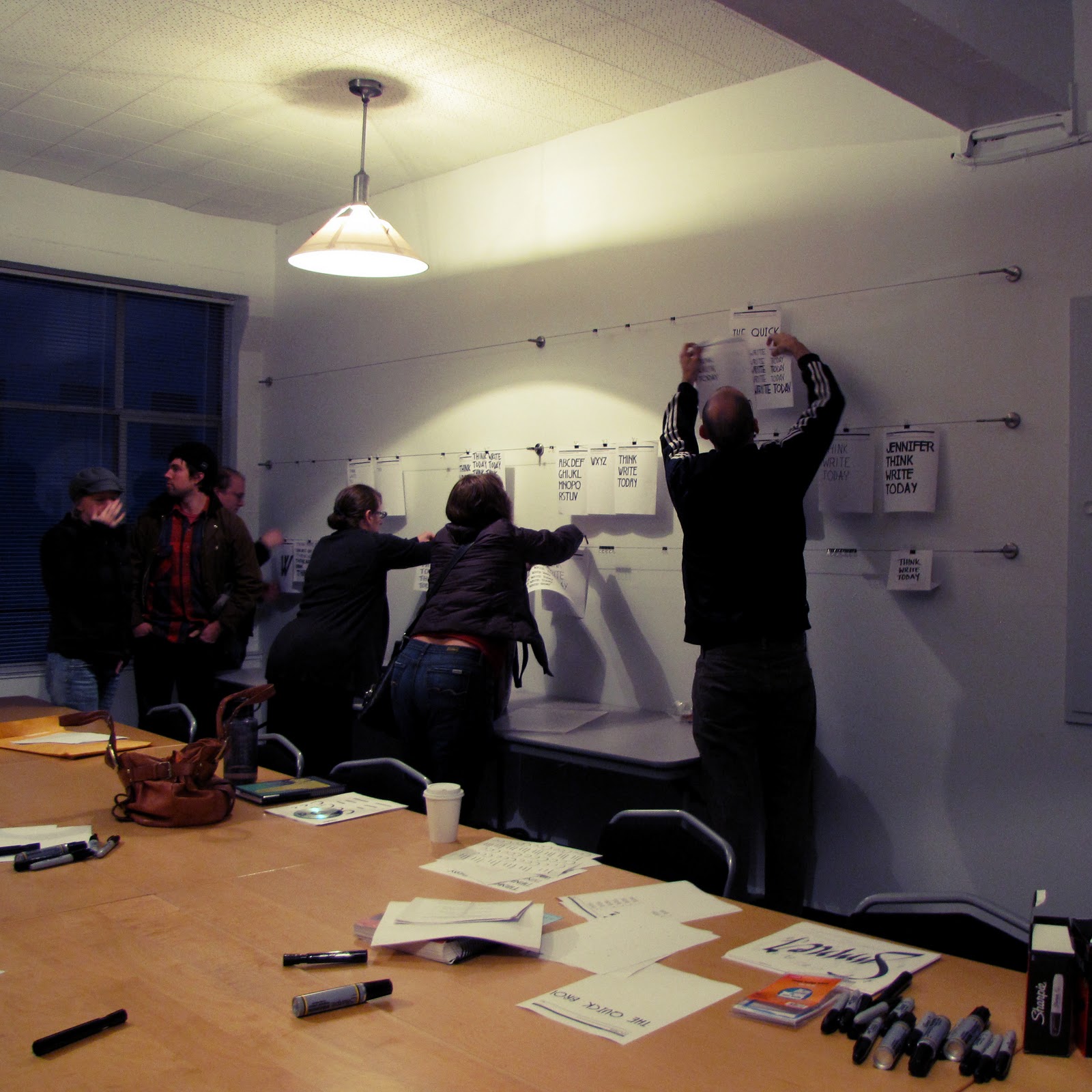
The workshop instructors were Jim and Bill Moran, brothers from Two Rivers, Wisconsin. They came all the way from the Hamilton Wood Type Museum, where they do their lives' work, to spend some time with us typophiles. To prove their love for all things letterpress, they traveled with some precious cargo in tow: a set of blocks from Hamilton Wood Type’s Globe Printing Collection. As stated on the Type Americana blog, "This group of plates, which offers a peek at American advertising culture from the 1930s to the 1950s, provides a rare opportunity to work with a vintage collection of printing history." It was a fabulous opportunity that each of us seized with gusto!

Below is a series of shots documenting our morning in the print shop. Enjoy, and holler if you have any questions.

These little pieces of wood are called furniture. Cute. They're what you use to position your plate/blocks correctly on the press and keep them where you want them.
I think someone was dreaming of Tiffanys...
Think of all the different messages these blocks were used to print in the past...It's pretty cool that they continue to help us communicate, present-day.
Bill giving us the run-down. My printing buddy, Glenn Fleishman is the angry-looking man on Bill's right. He's actually really fun and not angry at all. :) Though I don't have any shots of us working together, we made a great team. Thanks, Glenn!
The blocks from Hamilton Wood Type’s Globe Printing Collection
Our first plate, which we had to stop using after only two prints due to some damage. When they find damage, they do one final proof of the plate and then create a replica of it using a router (much more high-tech than how the original was made) so the block can be retired, but it's image can continue to be used and enjoyed.
Our second choice: Sportsmans Park, a 2-plate set. 
I guess we had a thing for horses.
My new friend Joy from Austin, TX
Vibrant fives!
This blue hue was in high-demand.
The master at work: Mr. Jim helping us set our second plate in the set, skilled in using furniture.
Me, pretty excited about all of this.
P.S. The Space Needle is right out that window.
Our third plate of the morning.
You can't get much more Americana than this:
Farm kids, a pig, a cow, balloons and a plane.
Hamilton actually made most of their money from the manufacturing of  "Composing Room Equipment" (like cabinets and things), not type. If you'd like to know more about the history of wood type and Hamilton, you can read about it all here.)
"TOMATO IN CONCERT" - On the press and ready to roll.
Me, intense.

"TOMATO IN CONCERT", up-close. This combination of blocks still makes me giggle a little. Can you imagine tomatoes in concert? All I can see is something along the lines of Veggie Tales.
Joy and I showing off our "TOMATO IN CONCERT" meets Farm Children.
Being a good little printer: cleaning. Note who's behind me, to the left: Richard Kegler of P22 and the Director of Making Faces!


Up next! 
Part 4: Font Workshop, to drop Monday morning following the holiday weekend. Stay tuned. And be sure to eat plenty of turkey....or tofurkey, whichever you prefer.

Tuesday, November 23, 2010

Simple Identity Design Showdown on Facebook

Friends!

Remember that little shoe company logo I was working on? Okay, so maybe it's not so little. It's actually a really big deal. Round 2's wrapped up and all the logo submissions are officially up on Simple's facebook page.

Visit their "You vs. Agency" tab to peek at them and 'like' your favorite. Enjoy!
(Read more about the competition here, if you'd like.)


Sincerely,
Megan


Type Americana: Part 2 (Film Screening)


After the 8 lecture series I attended at SVC's Type Americana on Friday, December 12th, I zipped over to the Northwest Film Forum in the Capitol Hill neighborhood for the screening of Making Faces: Metal Type in the 21st Century. The film was pretty awesome; as the Stranger reviews, "Watch an older man with a tidy goatee pour molten metal into hand-carved molds for a newly-invented typeface! Design documentaries: pretty awesome." Ha. It's so much more than that, but it's also exactly that.

It captures the process legendary type designer Jim Rimmer used when creating metal type - from sketching all the way to the final metal face. The font showcased in the film is Stern, named after Chris Stern, a friend and letterpress artist who passed away in 2006. (His studio lives on.) Stern was the first font to ever be released as a digital font and a hand-set metal type simultaneously. Pretty darn awesome. (You can buy it here. And really, why wouldn't you? It's gorgeous, as seen below at myfonts.com)
We got to watch the film and then sit in on a Q&A time with its director, Richard Kegler. One of the first questions posted to Kegler was something like. "Have you always been interested in type or is film more your thing?" It just so happens that Kegler is one of the founders of none other than P22, a major US type foundry. Basically, he is type. (How did we all not already know that?) Again, awesome.

What made our short time with Kegler even more memorable was when someone asked about the relationship between Rimmer and Stern, the font's namesake. Kegler admitted he couldn't really speak to that and someone in the audience piped up and said "I can." It turns out Chris's wife was in attendance. She gave us all clear insight into the amazingness of Chris and the tenderness and generosity of Jim. He too passed, just this past summer. Having that unexpected information was pretty awesome, too.

The film is like a time capsule in motion - capturing the details and beauty of an almost-lost art. For that we should be forever grateful. Whether or not you're into type, it's pretty important.


Okay, all that said, you've got to watch what's available online now. > Making Faces trailer
You can also peek at it elsewhere online:
it's blog,
it's Kickstarter page,
and
the Stern Specimen booklet.

P.S. If you purchase Loxley, all proceeds go to Making Faces, per Jim's wishes.

Type designers are pretty awesome.

Monday, November 22, 2010

Type Americana: Part 1 (Lecture)

On November 12th and 13th a large group of type enthusiasts gathered for several lectures and workshops at the School of Visual Concepts in Seattle, WA. I was lucky enough to be one of them. It was called Type Americana. Over the next week or so I'll be recapping who I met and what I learned so you can get in on a little of the fun too. Until next year, that is. They'll definitely be hosting the conference again; it was such a hit. Disclaimer: if you do go, know that you will encounter more than your fair share of typography scholars, designers and generally remarkable design giants. It might even be a little nerdy.

This past year we brushed shoulders with individuals such as Steve Matteson of Ascender Corporation, Patricia Cost, a soon-to-be published author, Thomas Phinney of Extensis and Sumner Stone who was at Adobe for time and now runs Stone Type Foundry Inc. (If you've been a Adobe product-user for a while, it's likely you are familiar with the font named "Stone". Yeah, he's that Mr. Stone.) It was a really great day, full of learning and meeting new friends from Montana, Texas, Wisconsin and Minnesota...along with some of the locals. To think of recounting the lectures in summary is sort of overwhelming, to be honest. In lieu of the outlines that won't mean anything unless you were there, here's a short series of snapshots from the day.

Enjoy. And stay tuned for more from my type-filled weekend in the Emerald City.

See, super nerdy, huh. I love it.

Until tomorrow - Ciao!

Thursday, November 18, 2010

GFU Professional Preview Day

Yesterday I had the privilege of hosting two students for George Fox's Professional Preview Day: Austin Tott and Siyu Qu. They were both charming and so willing to soak up the experience. Austin is an aspiring photographer and designer and Siyu came from China a short three months ago to study design and management at George Fox. When I was studying at Fox, the design program was still in its infancy so there weren't many graduates in the field. Now that the program has grown I'm thrilled to be involved and provide a window into the life of a designer for whatever students are interested. It was a fun day. Austin and Siyu got to see a little bit of the working designer world and I got two new friends. Win-win!

Monday, November 15, 2010

Simple Identity Design Showdown

The last 6 days have been consumed by Simple. I'm still saying, "Are you kidding me!?" but am happy to announce that I've completed my response to Simple's brief. You can find it posted on Behance, (along with the other contestants' entries) or view it below. Let me know how successful you think my final submission is in the comment section, here or on the Behance project page. Remember to click to appreciate it while you're there! If you do appreciate it, that is.

---------- 


Simple is exactly what it claims to be: simple. As we all know, Simple has always been understated, classic and straightforward. But that doesn't mean they're not creative. They were the trailblazers for the "green" shoe, but they're not the type to get miffed when others followed their lead; they're more concerned about planet than copycats.

Consequently, the logo that I've designed for Simple is approachable and kind. It says, "We're serious about what we do, and we have some serious fun while we're at it."

I was really inspired by this attitude as well as their "less is more" mantra. Therefore, the type is direct, minimal and modern. There are no excess elements. In the icon, the opposing markers not only mimic the treads found on Simple's recycled tire soles, but they communicate the company's movement, progress and enthusiasm. It is also a visual reminder that what you give is what you get. Isn't that what sustainability is all about? (And, if you really want to see it, the brand's initial is in there, too.)

It's a versatile mark that works well large and small. The wordmark and icon are successful together or alone.

Creating something simple is harder than it appears. Using less is more challenging than using more. The process I went though creating this mark is a reflection of the Simple mission. Don't settle. Use less. Do better. Be simple.

Read more about the competition here.
----------