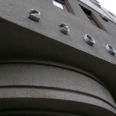
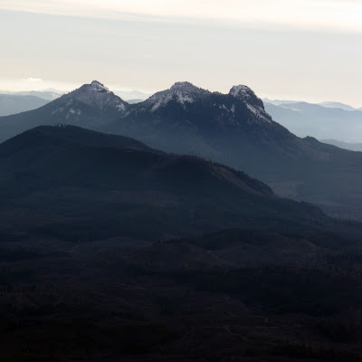
Late last week I took myself on a walking type tour through my office neighborhood. It was the perfect antidote for the lack of focus that inevitably occurs the day before a holiday break. Below is the evidence of the fun I had, with a couple of shots I took at Pearson Field before the flight last week. Enjoy...and don't hesitate to let me know what you think of such a geeky activity. If you want to join the club, just holler. *Grin*
Monday, December 27, 2010
Friday, December 24, 2010
Bryan Rupp Photography | Sneak Peek!
This morning I have a little sneak peek for you. It's another letterpress business card and it's for Bryan Rupp, of Bryan Rupp Photography. Bryan and I both went to George Fox University. He transferred in and quickly became known as "Awesome Bryan" across campus because he was just that nice...aaaaand he used the word "awesome" very liberally.
After school Bryan took up photography and his hobby quickly grew into a successful business. I've enjoyed watching Bryan's work (he's really good!) from afar and am now thrilled to be his designer, helping him amplify his brand. He came to me with a logo and we'll be developing even more once the business card is complete. Below you'll see the plates and a preview of both the front and back of the card.
We're running the cards at Brown Printing here in Portland. I'm ever-awed by the letterpress process and especially like working with the crew at Brown. They know their stuff.
It will be really fun to show you the end product. There's a special shape in store for this business card. Bryan and I will reveal it in it's finished form in the new year. Until then, enjoy the holidays!
Labels:
Business Cards,
Photography,
Portland,
Print Shop,
StudioM Design
Thursday, December 23, 2010
New Studio Client: Freedom Fashionistas
Here's an excerpt from the creative brief, created by Jim Terry, owner and copywriter at The Mother Ship:
"Freedom Fashionistas is an organization started in 2010 as a vehicle to provide economic opportunity and stability for women in need by bringing their products to the marketplace. Our goal is to make a difference in the world by focusing on women – particularly women freed from or at risk for Human Trafficking.
Our first project is a sewing center with a product line of pajama pants. FF will provide the fabric and necessary materials to sew the product. The women will receive a fair-wage price for each piece, with an additional amount set aside in a bank account. These funds will be disbursed to the woman upon completing the program being provided by our partner agency – and can be used to help a woman start a business, pay for school, or find housing.
Through partnerships with like-minded organizations, Freedom Fashionistas will collaborate to meet the spiritual, emotional and economic needs of women to offer hope, so that each woman, along with her children, will experience what it means to be truly free."
Several other logo options that came from the exploration:
Labels:
Logo,
StudioM Design
Wednesday, December 22, 2010
Lessons learned from a failed event
During an event I attended this past year I had a conversation with a friend via text. (Gasp! I know, so disrespectful, but you'll understand why shortly.) It went a little something like this:
Me: D-R-Y
Her: And way overscripted
Me: Painfully. Yikes.
Her: Should have brought coffee. Yawn.
As you could probably gather, the event basically bombed. I left feeling super disappointed and (as illustrated by the texting) am certain I wasn't the only one. They say you learn more through your mistakes than your successes. I've decided that whenever possible, I'm going to learn more from others mistakes so I can avoid making my own. Smart, right? Thanks to my mentor's encouragement, I've taken the time to analyze what didn't work at this so-called failed event so I can do just that.
Disclaimer: My point here is not to be cynical and nit-picky, but to provide some relevant thoughts for those of us who do public speaking from time to time, particularly as creatives.
Before diving in, here's a brief synopsis of the event components:
- Presentation on design/marketing/branding
- Real life case studies
- Q&A
And now, the lessons:
------------
1. Engage your audience.
My dad's done a ton of public speaking. Growing up, I sat through countless previews. The one thing he was always sure to do was engage his audience. Many times this included a story about myself of my sister; the fact that they were personal and sometimes embarrassing made them all the more engaging. This Speech 101 principle is easier said than done, admittedly, but there are many ways to accomplish it. (When all else fails, give away money!) The presenters at the event did everything but engage the audience. They read from a script and, well, other points to follow.
2. If you love what you do, it should show.
Design, marketing and branding are fun. Talking about it should be, too.
3. Be transparent.
As previously mentioned, a couple of case studies were featured and the documents involved in the study were referred to but we didn't get to see a single one. Instead of just referencing what you studied and learned, show your audience. (Think photos, charts, videos, stories and hard facts.) They're hungry for it and likely paid good money to be privy to it. What you give your audience in being transparent is the marrow of your presentation. They'll connect to you and connect with what you're saying...and isn't that the whole point? I've decided that the "show" in "show and tell" is first for a reason.
4. People are (generally) smart.
There are way too many buzzwords in the world. It seemed we heard practically every one on that wearisome day. I'll admit that I too have had some fun with my marketing dictionary, but that's something I can do on my own time. When I've come out to hear experts in the industry speak, I want to hear new ideas, not text-book tactics sandwiched between buzzwords. Blech.
------------
The failed event was unfortunate, but I feel lucky to have been there. A) Because I learned more from it than what I might if it had just been okay. B) It was a great reminder to feel fortunate to have been able to attend several fabulous presentations over the last couple of years (by Devin Liddell, Aaron Draplin, Frank Chimero, Jelly Helm, Sumner Stone and others), all of which have given me some lofty standards. Disappointment only proves you were once satisfied.
Photo credit: Li Song via Flickr (type overlays by yours truly)
Labels:
StudioM Life
Monday, December 20, 2010
a birds-eye-view
Things always look a little different from above. There's something about an aerial view that inspires awe, curiosity and a new-found perspective on life. I had the privilege of getting just such a view last week. My husband, the proud holder of a private pilots' license, convinced me to play hooky from work on Friday morning and take a flight with him. After weighing the pros and cons (which included but were not limited to the following: cool photos vs. missed client calls, time with the hubs vs. wearing a rented headset, sunshine and beauty vs. the ever-present fear of crashing) I decided to go. And a new level of trust was born.
There are some gorgeous views from the ground in the Northwest. Those views only get better from 3000 feet in the air. Plus, the birds-eye-view makes one notice pattern, texture, light, line, contrast and other things that would otherwise go unseen. And that would be a shame. So, enjoy these (many!) second-hand flight visuals and don't forget to play hooky.
There are some gorgeous views from the ground in the Northwest. Those views only get better from 3000 feet in the air. Plus, the birds-eye-view makes one notice pattern, texture, light, line, contrast and other things that would otherwise go unseen. And that would be a shame. So, enjoy these (many!) second-hand flight visuals and don't forget to play hooky.
the current reveals itself
Mount St. Helens on a clear day
reflective
foreboding fog
lumber commerce in action
repetition is abundant in nature
maps are amazing
no wonder so many rivers go by 'snake'
a river bed
the coastline at astoria
mountainous majesty
layering
land, organized
this is where all the rain goes
what makes the water different colors?
a grown-ups' sand box
home
Labels:
Inspiration,
Pattern,
StudioM Life
Wednesday, December 15, 2010
I designed a terrarium.
I made this at Artemesia last night at a Make-Your-Own-Terrarium workshop. It was super fun and I highly recommend you do the same. Building a composition and laying out a tiny ecosystem requires creativity (and small fingers!), but offers peacefulness and calm to those who spend time doing so. It's a natural, three-dimensional version of what us designers (or any creative individuals working digitally) do every day.
You can read more about the experience here.
You can read more about the experience here.
Labels:
Portland,
StudioM Life
Tuesday, December 14, 2010
Officially Official
The name is on the door. And that means it's for real. StudioM is Clark & Co. (Never mind that our website, blog, business cards and business documents don't bear the new brand yet. That time will come.)
While my office mates and I ogle at the door, check out their stuff, too:
While my office mates and I ogle at the door, check out their stuff, too:
Labels:
StudioM Life
Subscribe to:
Comments (Atom)


