Wednesday, June 30, 2010

Dance your heart out. It's good for the soul.

Sneak Peek Alert! Project: www.wheretoballroomdance.com

"To us, dancing is everything. We're always looking for a chance to dance and are better for it. We know there are others out there who feel the same way — others who find nothing more satisfying than the perfect waltz to a slow ballad or an invigorating quickstep powered by a jazz number. Whether you're an avid dancer or simply a beginner, we want to help find a place for you to dance. This online resource is made from an extensive database and showcases a variety of studios and dance events, all searchable by location.

So, what are you waiting for? Finding a place to dance your heart out near you is now at your fingertips."

Okay, so it's not at your fingertips yet, but it will be soon. Partnering with Matt Johnson (programmer and database guru) of Twisted Industries, I'm designing a site that will be a huge resource to dancers all over the United States. It's a user-driven site, offering registration to studio managers and owners who want to post their events as well. I'll be sure to let you know when it launches. Until then, here are three proposed design directions. Which one makes you want to tap your toes and dance along?

Thursday, June 24, 2010

A little letterpress love.

As promised, here's a little peek at the first press check I did for Melissa Tomeoni's business cards. We ran the cards with Brown Printing in North Portland. I've raved about them before. Although I already knew I'd fully trust them with letterpress work, I was never given the opportunity to work with them on a letterpress job until now. And after all is said and done, I trust them even more.
My first review - the emboss/deboss was flip-flopped, but it was gorgeous.
This is the counter die. The other die is above, out of the photo. The paper is pressed between the two to create a double-sided blind deboss/emboss.
The cluttering of tools, tape and paper makes me so happy.
This is Dick. See Dick print.
All kidding aside, Dick's been with Brown since the beginning - over 30 years ago. It's refreshing to see someone who is whole-heartedly in his element, and a master craftsman to boot.

Wednesday, June 23, 2010

Melissa Tomeoni. Luxury & Letterpress.

Modern and Luxury are two words I would use to describe Melissa's work. She has a way with light, composition and detail that is unmatched. Her work is contemporary, but her training was classical and the combination of the two is intoxicating. Therefore, it was only fitting for Melissa's business cards to have the same quality. In the design process we kept coming back to our two key words: Modern & Luxury. We stretched out of the business card comfort zone in a few ways to make sure the cards resonated with this tenor. All images ©MelissaTomeoni.com
  1. Firstly, the odd size. The standard business card is 3.5x2". This one is 3.5x1.25". It's slim, streamlined and modest in size. It makes you look twice.
  2. Secondly, we chose to be scant with the information on the card. There's no title, description or even individual name shown. This doesn't work for everyone, obviously; the fact that the company name is Melissa's name helped our case a bit. Additionally, one can really find everything they need online. The mystery of the unstated industry will ideally serve as a lure to get the recipient online where Melissa's work shines. 
  3. Thirdly, the logo isn't even printed. It's a blind deboss. This technique dates back to the mid-15th century and is achieved using the letterpress process. It's extremely classic, but when used without ink and marking a geometric logo, sings modernity. I was personally thrilled that Melissa sprang for letterpress. It requires a toothy paper (which I love), really purposefully design to make it work on both sides of the card (which I love) and at least two intense press checks (which I also love). You wouldn't even believe what the pressman finagled to make the cards perfect. I don't care how technologically advanced we become as a culture and how much I love my iPhone, we will never be able to replace human hands, hearts and heads in this and so many other fields of work. (I'll post a few choice photos from the first press check tomorrow.)
The end result is a very tactile, sophisticated business card that communicates all the modern luxury Melissa Tomeoni Portrait Photography encompasses.

Tuesday, June 22, 2010

Glimpse of my grindstone

My nose has definitely been to the grindstone as of late, which sounds drab and dull, but is exactly the opposite when you love what you do and the end result looks like what you'll see below. If you don't know, I've been tinkering around with design on the side of my studio work on a project called hi, friend. We (meaning myself and my lovely business buddy Jennifer Mele) quit holding our breath in April of this year and finally launched the site: www.hifrienddesign.com. It's an online retail space where you'll find printed goods and gifts like stationary, candles, wine bags, semi-custom wedding sets and the like. Our goal is to overload the shop with many twee things that will make your little hearts twitter. 

All that to say, I can't help but share what's been going on in that realm of my life with all of you present in the other, StudioM-centric realm of my life. So, without further ado, what follows is a post excerpted from the hi, friend blog:

----------
As I alluded last week, you're going to melt when you see what we have for you today. Dani Ross of Weddings Fresh coordinated a style shoot to showcase several of us in the wedding industry. When she asked if hi, friend would be interested, we said "Yes!" as emphatically as a bride would say "I do" to her groom. That might be an exaggeration, but you get the point. Needless to say, we were honored to be a part of the collaboration and are thrilled to share it with you. And, to top it off, we're announcing the debut of the English Department Wedding Set in our online boutique. Available for order as of today. Melt away! (All images ©JessicaHillPhotography.com)


Wedding concept design and production:  Weddings Fresh
Photography:  Jessica Hill Photography
Floral design:  Studio del Fiore
Invitation suite and paper design:  Hi, Friend!
Tablescape rentals and desert table styling:  Swanky Tables
Desserts:  Le Cookie Monkey


Ciao for now!
Meg & Jen
----------

Thursday, June 17, 2010

Reach Group | Website Preview

Reach Group, the creators of The Free Agent Formula and Modern Entrepreneur, contracted StudioM to revamp their website (www.reachgroupconsulting.com). It's been a honor and we're really happy with the direction it's headed.

This first design was from the first round of comps.
The second was from the first round as well.
This third design is a modified version of a comp from Round 1, and it's the one we've chosen to run with. 

Once you enter the site, this is how it will be organized. 

I'm so excited to see it live with it's happy popsicle colors and abundance of white space. Hey JoJo Studios will be programming it shortly.
Click here to visit The Free Agent Formula.

Tuesday, June 15, 2010

UpTown Ballroom | Website launched!

It's launched! Check it out at www.uptownballroom.net. Good work, team: Matt Johnson of Twisted Industries and Michele Johnson of UpTown. (See our previous post while you're at it.)

Type & Trinkets

You know you're obsessed with type when you read a magazine, book or brochure and when you've finished you realize you haven't really read anything, you've just ogled at the ascenders, descenders, kerning, ligatures and serifs, or lack of. You also know when you're obsessed with type when your friends bring you type books as souvenirs from far-off places. My dear friend Evangeline was shopping in London en route home from Russia and thought of me when she saw  New Vintage Type, a 2007-published book by Steven Heller and Gail Anderson. She also got me an awesome purple leather arm band and some print samples. Way to make me drool, Vang. Next time all I ask is to jump across the pond and shop with you.


"A designer indifferent to letterforms is not really a designer," says Steven Heller and Gail Anderson in their introduction of New Vintage Type. I wholeheartedly agree. I've only made it through the first two chapters of the book, but am way too excited to share it with all of you to wait to write about it. I was thrilled (though not surprised) to see two of my favorite design idols featured: Elizabeth Morrow-McKenzie and Louise Fili. And I've found a few new favorites: Matteo Bologna, Marian Bantjes and Sharon Werner.

Well, all this talk of type has got my stomach a grumblin', so I think I'll go blag a sarnie, as the Londoners would say. Good day, all.

Thursday, June 10, 2010

Modern Entrepreneur | The beginning.


As I'm sure you've gathered by now, I’m a self-employed, goal-driven, work-obsessed design studio owner. Being a business owner is hard work. Last year I met Lisa Johnson, co-author of The Free Agent Formula (which you might already know). In a single conversation she revolutionized the way I viewed being self-employed, or a free agent. It doesn’t have to be so hard and even though I’m in business for myself doesn’t mean I should build it by myself.


Since then, Lisa has invited me to co-direct a 10-week program for a collection of people journeying through the Free Agent Formula as a group. This week we had an introductory meeting for the free agents who had expressed interest in the program we're calling Modern Entrepreneur (website to come!). It's going to be a big commitment, but promises big returns on the investment.


I can't even explain how excited I am to be a part of Modern Entrepreneur and what it might become. To have the beginnings of our group (shown below) in one place at one time was just...electric. I can already tell it's going to be a action-packed season for all of us.
Our fledgling group (left to right...sort of): Cheri Hanson of Inspired Outsiders, Dani Ross of Weddings Fresh, Bryan Rupp of Bryan Rupp Photography, Cassie Pruett of Reach Group, Justin Hoffman of The Natural Path, Jordan Philips of Joli Photographie and Hey Jo Jo Studios, Megan Clark of StudioM and hi, friend, Amber Carter of Carter Billing Services, Kirsten Nieman of Restored Style and Lisa Johnson of Reach Group.
The ME Launch Team (left to right): Co-Director Jordan Philips of Joli Photograpie and Hey Jo Jo StudiosLisa Johnson of Reach Group and myself, Megan Clark, of StudioM and hi, friend.

I'll be sure to post more once the program begins in late July. Hold on to your hats, folks!

Click here to visit The Free Agent Formula.

Wednesday, June 9, 2010

Retro Fashion Eye Candy > Addendum

I know you were dying to see the product of the before-mentioned sewing project of my dear mother. Here it is. In all it's 80's glory. Wow. Check out that couch. And that cheesy smile. Annnnd this might be the last time I'm compelled to post a personal photo. :) (Thanks for digging this out, Dad.)

Retro Fashion Eye Candy

When I was seven or eight-years old, my mom made my sister and I matching shirt & short sets out of teal Noah's Ark fabric (it was the 80's if you couldn't guess). We thought they were the coolest. What was even cooler - the coordinating pillowcases. Haven't you always wanted to match your bed linens? In all seriousness, I loved that outfit and I loved that my mom made it for me. (Love you, Mom.)

Making my own clothes is something I wish I could do, but I really just can't. Not enough time, energy or talent to go around. Maybe that should be part of my retirement plan. Until then, I just admire those who can whip up a skirt, hat or baby booties on the drop of a dime. Brianna Showell of Reina Style Consulting is one of those people. I've talked about her before. She's from the Midwest like me; when we met five or six years ago, we hit it off immediately. A few weeks ago I went to her place for our weekly girls' night and she handed me a super heavy Trader Joe's bag. It was chock full of old patterns and sewing magazines. She's a sewing junkie so her grandma handed off all of this stuff to her and she wanted to share the wealth...with me! I love retro illustrations (anything printed and retro, really) and there are some real gems in these books; hence the reason Brianna thought I might be interested in her overflow. Here are just a few of my favorites.


(Don't they kind of remind you of hi, friend?)
Thanks for sharing, Brianna! Cheers to fashion, crafty skills and matching your pillowcase.

Tuesday, June 8, 2010

ReStyle | Brochure

We just designed this brochure for ReStyle (it's going to print tomorrow) and I love the quote on the back, so I just had to share. If you're in the Albany, OR area ReStyle is a must-hit shopping destination.


Friday, June 4, 2010

Type Matters

The good news is that lately I've been getting a lot of great work.
The bad news is that I can't share it with you. Silly NDAs.

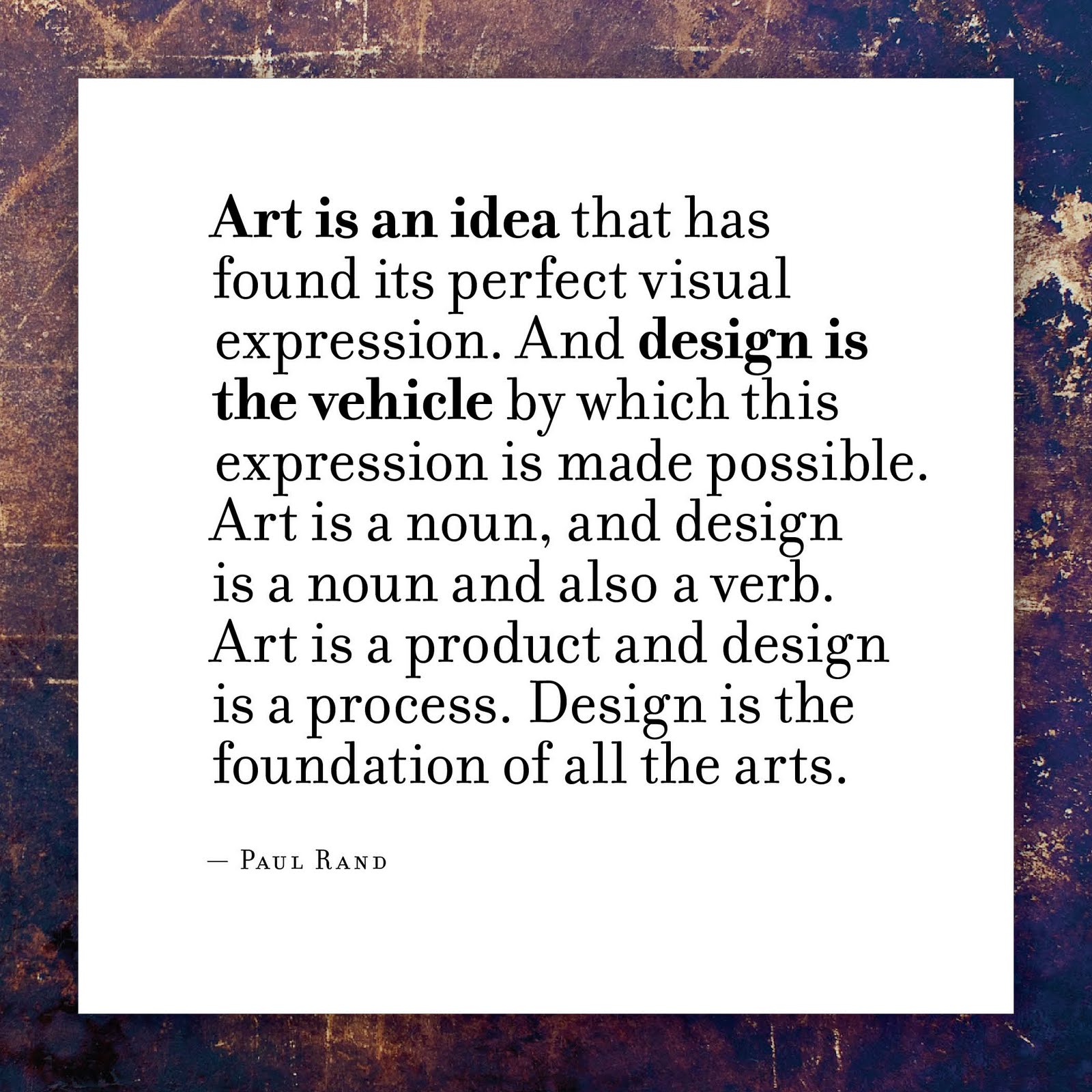
Therefore, in lieu of showing you some of my work today, I've thrown together a quick type study. It focuses on the importance of type selection. The fact of the matter is, type really does matter. When you choose a font, you are making a decision about what will be conjured up in the viewers' minds. Of course we don't have complete control over this process, but we certainly have a lot of power. Let's use that power well and pick appropriate fonts. (By the way, if you want to read more about the difference between a font and a typeface, read this.)

Here we go. I chose potentially the more generic fictional company name, Acme Industries, and featured it in several fonts. The only thing I changed was the font. Everything else about each feature is the same: all caps, stacked, same size. I've given you the name of the font (and I absolutely did not intend for all but one of them to start with one of the first two letters of the alphabet, but oh well), a little background on the font and what the font makes the company name suggest.
Font: Rockwell
Background: Created during the depression (1934), Rockwell is sturdy and angular.
What does it say? Something serious, having to do with machinery or manual labor. A manufacturing or mining company.
Font: Avenir
Background: Avenir is French for "future". It was created in 1988 with the future in mind.
What does it say? It's modern and streamlined. A software or pharmecutical company, perhaps.
Font: Archer
Background: Archer is a young 'un. It was created in 2001 for Martha Stewart Living.
What does it say? Cute and Chic. Cleaning products, make up, or sweet kitchen accessories.


Font: Baka
Background: Baka is even younger. It was created in 2006.
What does it say? It's human and unconventional. Could be a summer camp or something in the skateboarding industry.

Font: Bodoni
Background: Designed in 1798, Bodoni is a very vertical typeface that's full of contrast.
What does it say? High class and tradition with a little flair. A fashion magazine or ritzy hotel.

Hope you enjoyed the mini-lesson. If one of the fonts says something interesting to you, share it with us in the comments section below. Finally, if you want to read about a typeface I've declared we should never use again, click here.

Tuesday, June 1, 2010

Quote | Paul Rand