Wednesday, March 31, 2010

Women In Design | Event

This evening I attended yet another fabulous event coordinated by Kelly Coller, co-owner of OfficePDX. I was introduced to these Office events while I was a college student, craving contact with the city's top creative personalities.
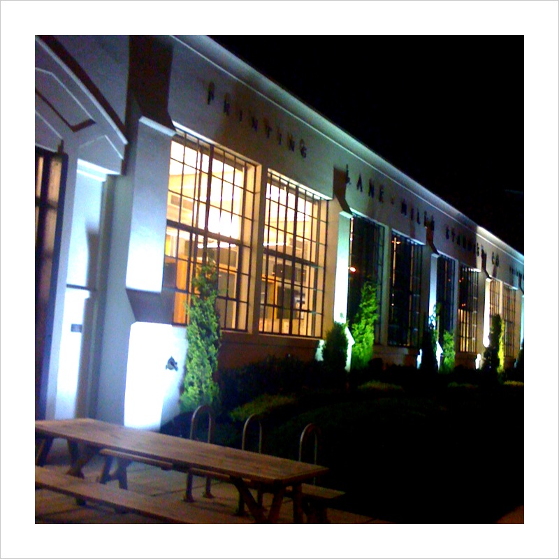
Tonight's event was held at North and featured Lourri Hammack (President of LAIKAHouse), Kelly Tweeden (Global Creative Director for NIKE) and Rebecca Armstrong (General Manager of NORTH). The panel discussion was focused on women in design. It was really inspiring to hear the trio's stories of how they've gotten where they are today. We heard about power suits with shoulder pads, mentors, gaining weight, sexual harassment and climbing the creative corporate ladder. Although all three of these women readily admitted that work really is like a drug habit (except it's legal and you get paid to do it), their most memorable advice had to do with not embracing workaholism.  Lourri stated, "Success at work does not define you." Kelly said, "If you're good, you'll be recognized." And Rebecca encouraged us not to measure success "by the amount of time you spend in the office". I'm planning on taking that advice to heart. Thanks for sharing tonight, ladies.
If you'd like to subscribe to OfficePDX's mailing list to get in on events like this, you can do so here.
For an audio interview with Rebecca Armstrong by Exceptional Women Northwest, visit this site.

Greenleaves, LLC | Logo Options

Greenleaves, LLC was recently started in Arizona. The company's founders have a few directions in mind for the venture and understand the importance of branding. But, until they reach the implementation stage, the varied branches of their business can't be specified. Therein lies the challenge: create an attractive mark that doesn't disclose the business' industry...rather, industries. What I can say is that although the initial branches of Greenleaves (no pun intended) aren't directly associated with each other, the overall goal is the same: Do good. Facilitate growth.  I can work with that. Each of the below options was presented in Round 1 communicate professionalism, efficiency, creativity, usefulness, quality and kindness.


The company name was inspired by a Bible verse: Psalm 1:2-3 "But his delight is in the law of the Lord, and on his law he meditates day and night. He is like a tree planted by streams of water, which yields its fruit in season and whose leaf does not whither. Whatever he does prospers."


Tuesday, March 30, 2010

Alchemy Dancewear | Flyer

Alchemy Danceware, as I've told you before, is being started by a local ballroom dance company owner who is having dancewear and gowns designed and produced right here in Portland. There are some big plans in the works. Meanwhile, to help spread the word, we created some postcards to be handed out. I'm not a dancer, but these images make me want to be one. Just to have an excuse to wear the clothes!
Photos by Doug Hoeschler Photography.

Friday, March 26, 2010

Car dealership gone cute.

Finally. A car dealership that wants to deal with the warm and fuzzy parts of car-buying. Forget all the yelling car salesmen with comb overs and the over-waxed, over-priced plethora of vehicles in the car lot . It's about real people. Real feelings. Real fun. 

The beginning stages of this project for a local ad agency produced the mood boards showcased earlier this week. I created 2 different directions and executed a poster and a billboard in each direction.


Wednesday, March 24, 2010

Gettin' in the mood.

I love mood boards. They're typically a collage of inspirational images, including color and texture, as well as words that captures the visual direction you're headed for a particular client. (See the ReStyle mood board here.) I did these mood boards last week for a local agency working with a car dealership in the New England states that's ready to break the mold. They're going for a very different branding approach than most (think shiny, sleek, pretentious, expensive-looking, all about the car). 

I usually only do one page, but I got really into this direction. Obviously. So there are two. Keep this mood in mind - I'll show you the work that came from it later this week.

Monday, March 22, 2010

The Meridian | Wall Art

The Meridian is a 6-story office and luxury condominium complex in Salem, Oregon. They contracted me to create some wall art for them. The idea was to create some very Northwest pieces using local landmarks and natural elements. 'Meridian' is a map term, so I also integrated some navigation visuals. We also had to be sensitive to the interior design color selection so the pieces would harmonize with what had already been established. They're designed to be 5x3' and 3x3'. The pieces haven't been finalized or produced yet, so consider this a sneak peek!

Wednesday, March 17, 2010

Ode to graph paper. By Megan Clark.

Blue strokes and white squares all lined up in row,
So organized, you make me feel so neat.
Blue lines, white squares, tidy and clean, you know
Nothing else in the paper aisle sheets
Can hold a light to the order you bring.
Small squares, large squares, you always make me grin.
In my office among paper galore
You are undoubtedly, truly the King.
The days my brain becomes cluttered and spins
You'll be there, the blue and white I adore.
P.S. I had no idea writing an official ode could be so difficult! Check it out here. The above ode is based on something between The English Ode and The Irregular Ode structure.

Tuesday, March 16, 2010

Quote | Wouter Stokkel

Wednesday, March 10, 2010

French Press | Print Ad

There's something striking about a well-done black and white print ad. Some might argue that if you need color to communicate then your message isn't good enough. I'm not sure to what degree I would agree with that argument, but in the case of this print ad for French Press, we've pulled it off. The ad is based on a promo piece we created to be used in-shop last year.
Client: French Press
Project: Newspaper Print Ad
Publication: Salem Business Journal
Art Direction/Copywriting: StudioM

Monday, March 8, 2010

Mexican Typography

Last week my husband and I went to Mexico via a cruise ship. We ported in Puerto Vallarta, Mazatlan and Cabo San Lucas. Of course I captured the entire trip on camera, but was particularly drawn to typography and signage while we were out and about in the sun. This could be for any or all of the following reasons:
1. When you can't really read what's written you pay more attention to how it's written than what it says.
2. Much of the signage in Mexico is hand-rendered. Therefore, it's demanding of authentic artistic talent and that makes it beautiful.
3. I ♥ type. Period.

Take a peek at some of my type study shots and see if you agree...

Friday, March 5, 2010

Our Portland Story | Sneak Peek #2

Waaaay back in April last year I posted about my assignment for Our Portland Story. Now, almost a year later, Melissa Delzio is wrapping the project up and is left with a few orphan stories. She asked if I'd be willing to adopt one and I emphatically said, "Yes!" I said yes because this project represents collaboration and creativity: two things I want to foster in my personal and professional life.

Here are the two layouts I've worked up for a story by Suzy Vitello about Tyron Creek and the love of her life. Her story begins, "For outdoorsy types, there is no sexier place to fall in love than Portland." Isn't that great!? And so true! Portland boasts some of the best hiking, biking, climbing and just plain 'ol views in the world. But enough from me....read Suzy's story in the pages below. Each page uses the same content and illustrative trail map, but was designed to communicate differently. The first is subtle and feminine. The second is forward and energetic. Which speaks most to you?


Wednesday, March 3, 2010

ReStyle | Opening soon!

Marianne and I have been blasting through the branding for ReStyle. It started with the logo and has continued on with exterior signage, business cards, flyers, hang tags, bag labels and the like. One thing I love about Marianne is that she's super decisive. She doesn't dilly-dally. Ever. Evidence of this is that ReStyle will be opening in March! As the flyer says, be prepared to swoon! The shop will be stocked with all sorts of current, quality women's clothing and accessories as well as furniture and home decor.
Not only is Marianne super motivated, she is super sweet. She holds an award for one of my favorite client compliments of all time: Thanks again for all of your awesome work. "You had me at the logo!" So she's funny, too! Just one more reason to get down to Albany, Oregon this spring and see what's must-haves you must have at ReStyle.

Monday, March 1, 2010

Quote | Robynne Raye


Robynne Raye is a co-founder of Modern Dog Design Co. in Seattle, WA.